
VENUE DESIGN · ALPINE VALLEY MUSIC THEATRE
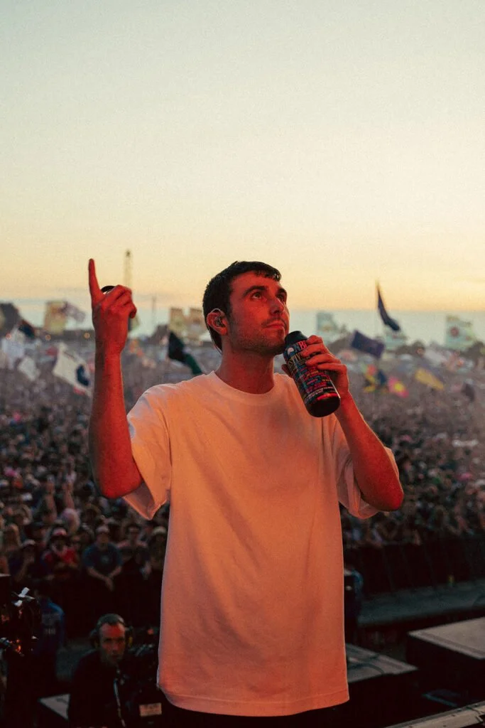
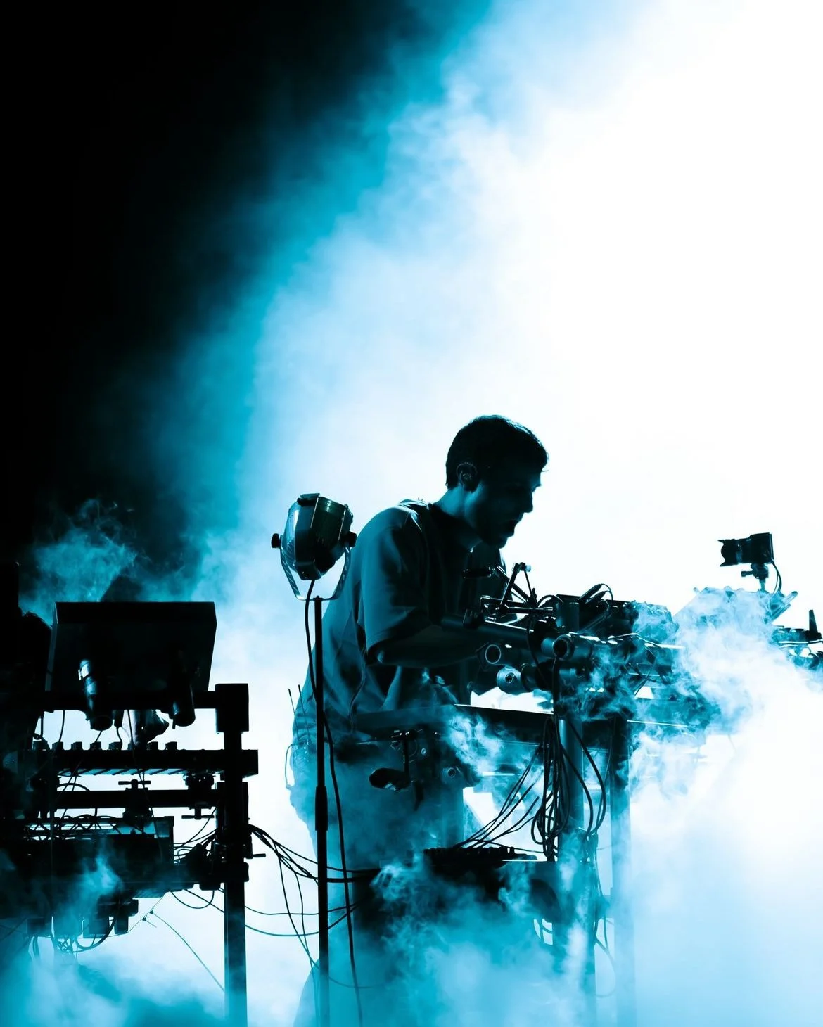
Fred Again..
Marketing design for a Wisconsin debut.
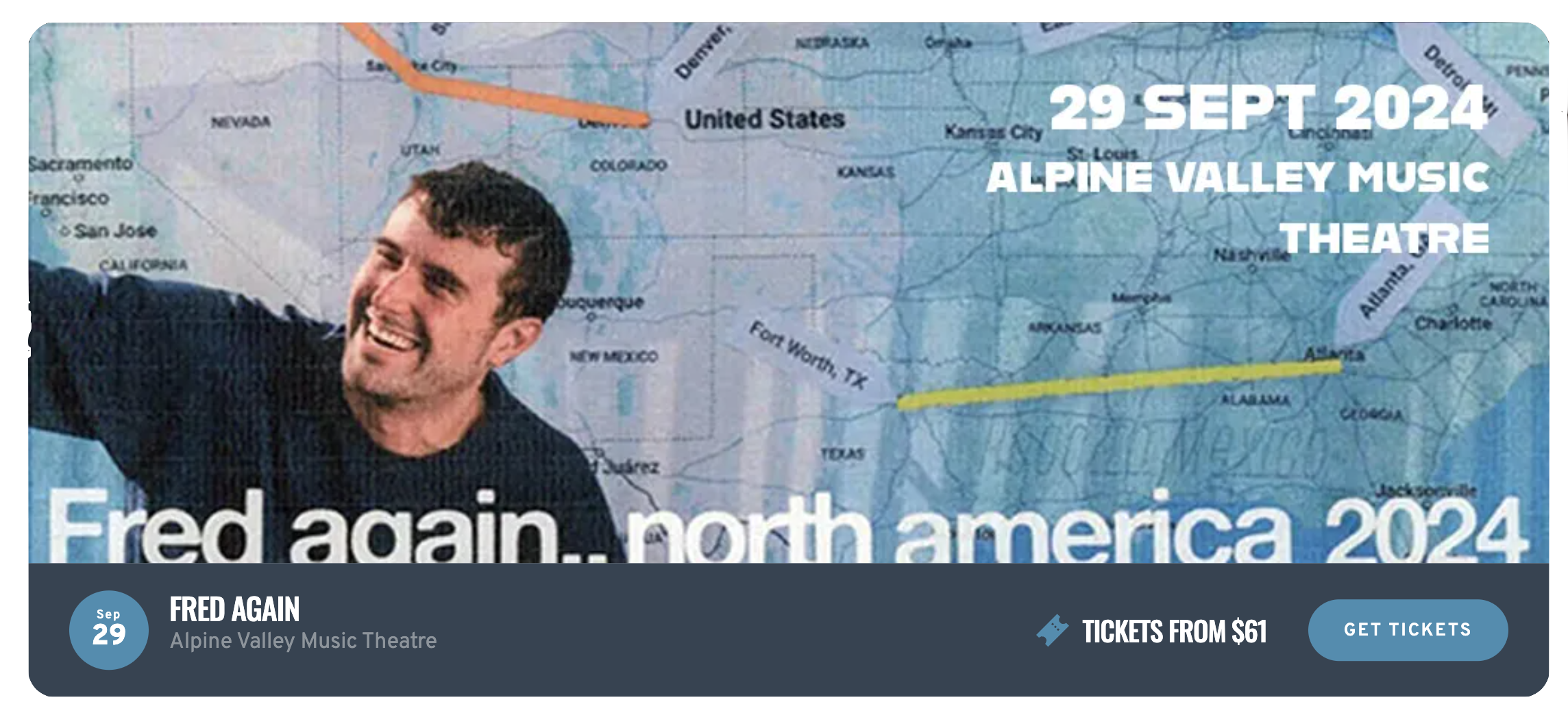
Contributed marketing materials for Fred Again's performance at Alpine Valley Music Theatre, celebrating the release of his album "Ten Days." Tasked with redesigning the venue map to reflect Fred's distinct aesthetic — blue-toned, cloudy, and unmistakably him.
Role:
Graphic Designer
Deliverable:
Venue Map & Brand Materials
Venue:
Alpine Valley, WI
Client:
Fred Again’s Team
againagainagainagainagainagainagainagainagainagainagainagainagainagainagainagain
againagainagainagainagainagainagainagainagainagainagainagainagainagainagainagain

The Venue
Alpine Valley Music Theatre

Early years
Alpine Valley opened its doors in 1977, quickly establishing itself as an important location for outdoor events. The theater’s stunning natural setting in East Troy, Wisconsin placed it at a prime location, connected to large towns and cities. Its location quickly attracted top artists and their loyal followings.
Iconic performances
Across the decades, Alpine Valley has hosted a long list of iconic artists. Some of the most notable events include performances from The Grateful Dead, Dave Matthews Band, and Pearl Jam. These artists helped to cement the venue as a must-visit spot for those who love live music.
The modern era
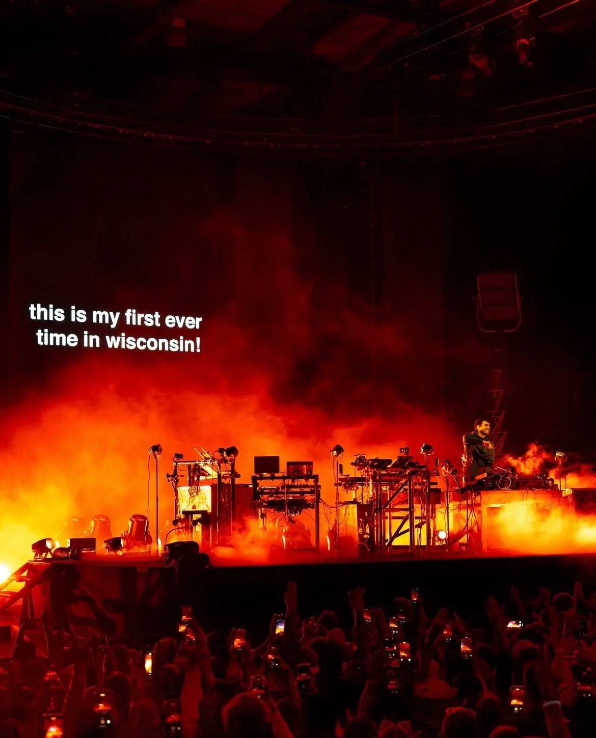
Alpine Valley, renowned for its scenic views, remains a premier destination for music festivals and concerts. Now managed by Live Nation, it continues to create unforgettable experiences, with Fred Again’s Wisconsin DEBUT drawing a new generation to this iconic venue.

“Yup, I’m on it.”
“We need marketing materials for this show.”
“Hey Yasko you’re creative can you whip up a map of Alpine to be more lively.”

The Deliverable
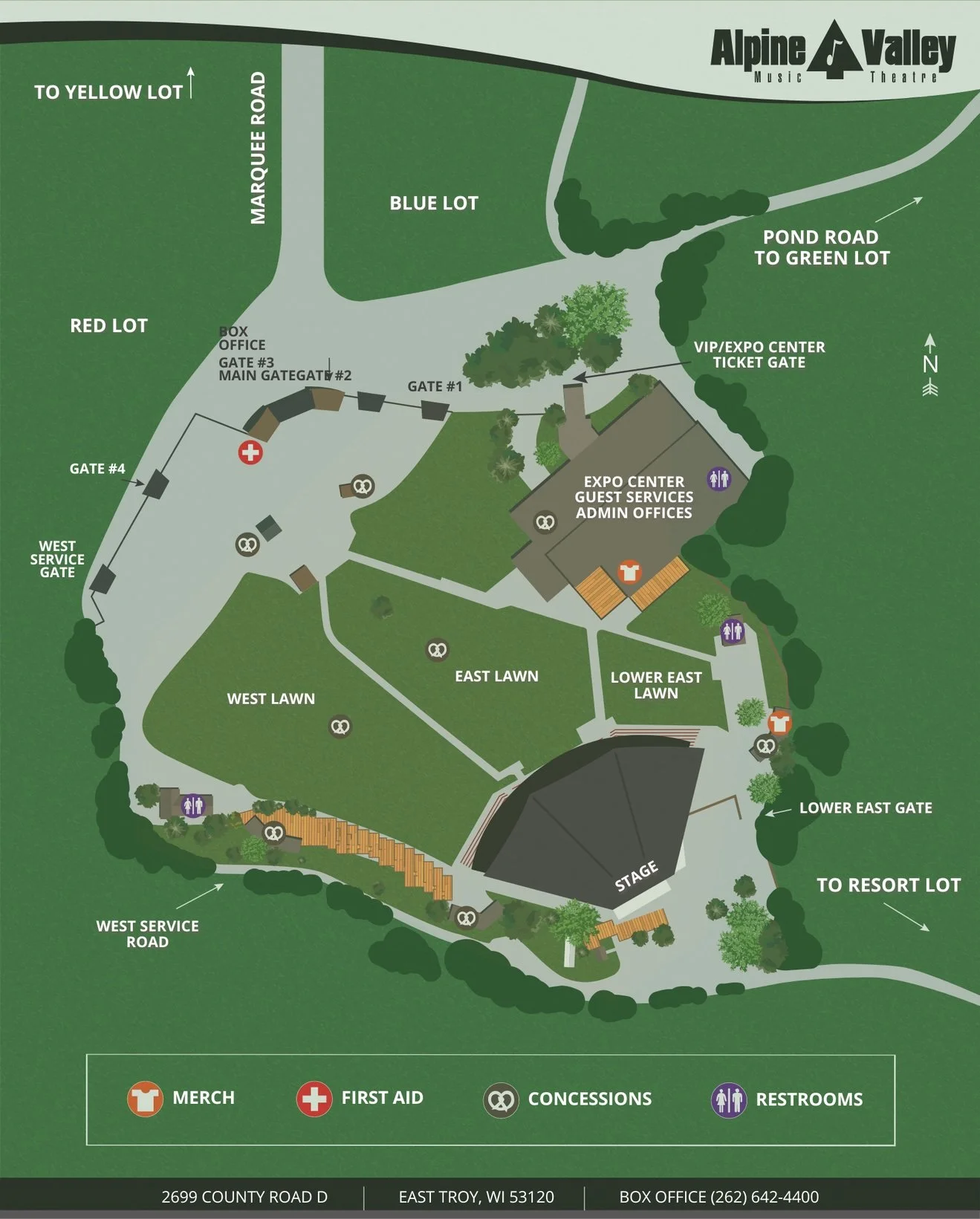
Venue Map
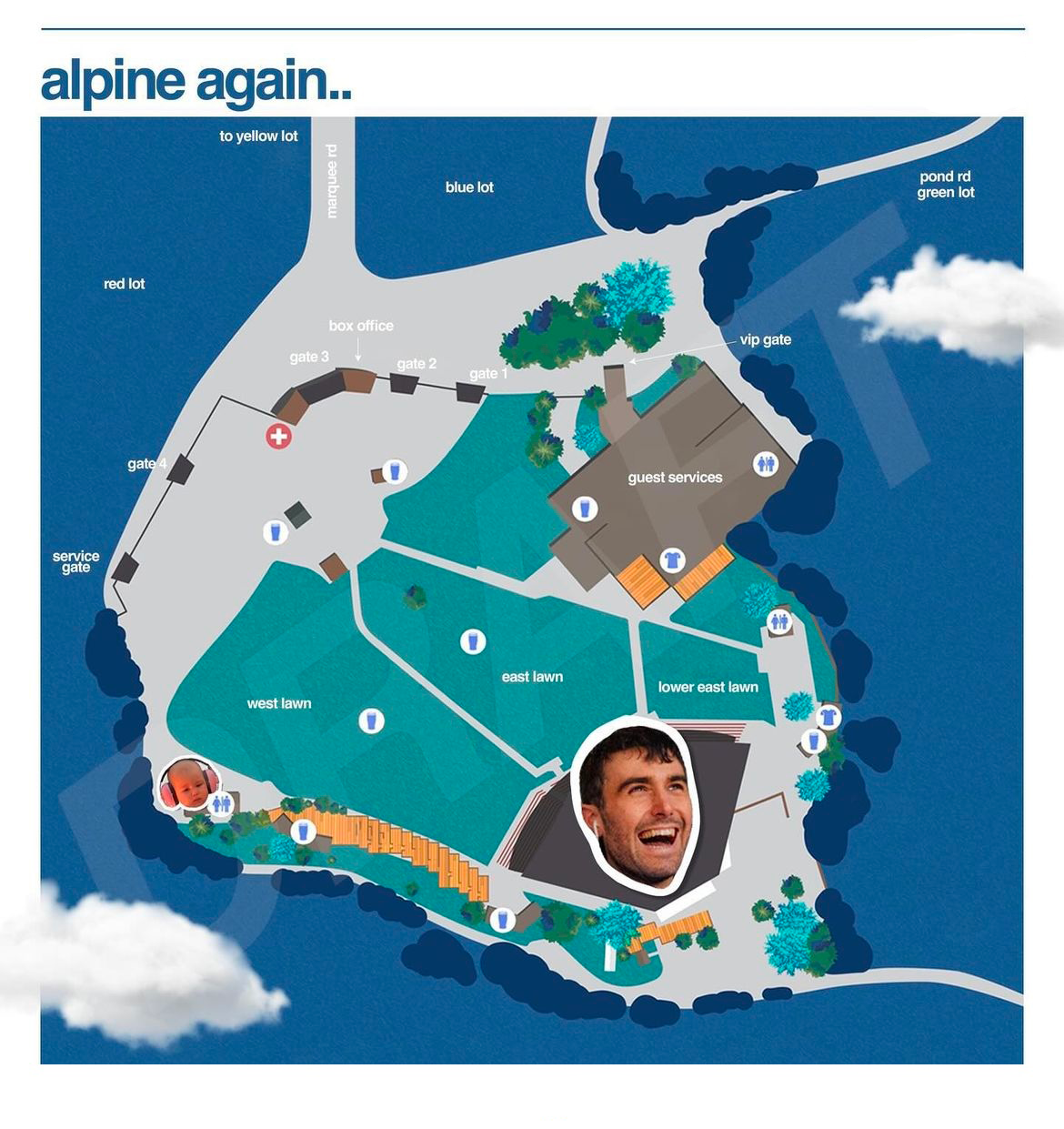
The original Alpine Valley map was functional but generic — nothing that felt like a Fred Again show. I was asked to make it more vibrant and on-brand, appealing to the younger audience coming out for his Wisconsin debut.
The redesign swapped sterile icons for personality-driven ones, introduced the signature blue palette, leaned into white space and clouds, and added Fred's nephew — a recurring motif in his visual world.


Design Process
Understanding the Fred Again.. brand.
I explored his website, social platforms, and drew from attending several of his shows to build brand guidelines that governed every design decision.


Color
Fred's consistent use of #647FDD is the most defining brand signal. This blue anchors every element of the redesigned map.
Iconography
Swapped out dated venue icons for fresh ones that align with the new color palette and Fred's visual personality. The concessions icon became a Guinness glass — his favorite beer.

Design Elements
Fred leans heavily on white space and a recurring cloud motif. Both became structural elements of the map — not decoration, but foundational to the layout.
Personality
Keep it fun and playful — after all, this is a Fred Again show. Pics of Fred and his nephew made it into the map, giving the whole thing a warmth the original lacked.

New Title
Renamed to "alpine again…" — a nod to the Fred Again naming convention that immediately signals whose show this is.
What Changed